
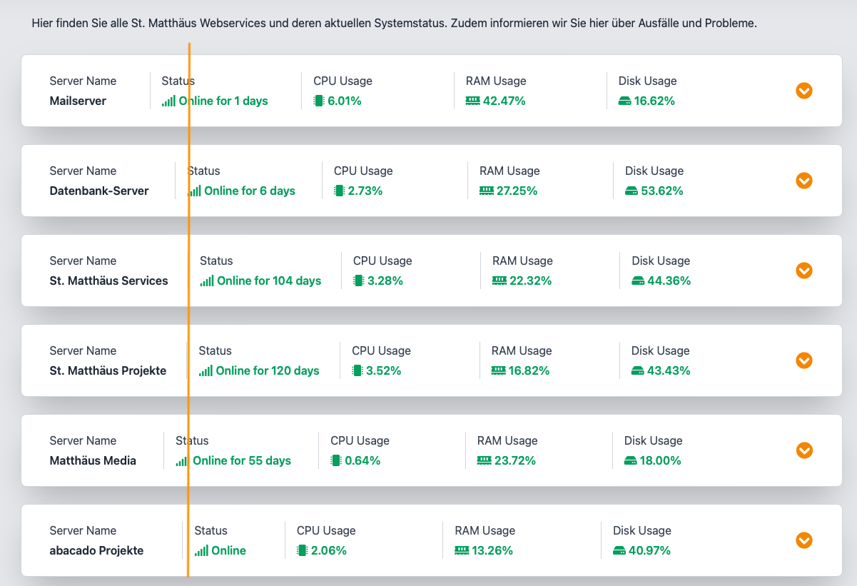
Depending on the name of the Server in each row of the status page, every column has a different width and the page looks a bit edgy. I think it would help, if every column of every row has the same width. That would increase readability a lot.
Should be a quick fix I guess :)
I made a screenshot - the orange line should illustrate what I mean :D
Thanks! Christoph


